
Thursday, April 23, 2015
Friday, March 27, 2015
Reflections: Caterpillar

This is a much more recent piece, 2010 or so, and unlike the previous reflection on the multi-spouted slab, this was much more deliberate and intentional - although it didn't realize in the way I envisioned it (which tends to be the case). The title came after completion, which I'll get to in a minute, but the idea of throwing a large bottle (turned out to be... 14? 15? inches) and then cutting it into segments and stacking them in a stagger formation was an idea in my sketchbook. I suppose this was a test piece and actually trying to make it provided some insight into how I might go about it the next time.
After I threw the piece, and prior to cutting it into segments, I put a groove into the body with a wooden knife; cyclically going up and down. I then let it dry a bit. In retrospect, I should have let it dry a bit longer. I think I was a bit eager to move the project along but a bit more patience would have served the piece better in the long run. When I cut off the sections, they were still a bit wet which ultimately gave it a droopy look. And again, I could have let the pieces dry a bit longer after cutting out the segments but at the same time I didn't want them to dry out entirely. A nice leather-hard state of the clay would have been ideal. Another thing that struck me was that I should have thrown the walls a bit thicker. As you can see in the picture to the far right, the walls are a good size for a bottle this big but for the purposes I had in mind thicker walls would probably have provided a bit more stability and facilitated the stacking process. There simply wasn't enough contact between the pieces to firmly connect the segments.


Nonetheless, I made due with what I could. I was determined to make it work somehow. Another thing that became strikingly obvious and something I didn't think of in my sketchbook was the effect of gravity! Haha duh, right? What this means is that there was a series of balancing acts that had to go into re-assembling the sections into a stagger and how to position each piece became it's own little struggle. It got sloppy and assembling it wasn't as easy as I thought it might be. Cracks starting appearing because one section wasn't bearing the weight - too wet or the walls were too thin. This prompted the use of more clay on the sides and a viscuous slurry to give the smearing look that you can see in each of the pictures above. I liked the smear. Improvised ideas become "artistic" when it amends structural inadequacies.
I liked the idea of smearing clay and giving a certain "organic" texture to the piece. Something I'm likely to explore further when I get another chance. But the process of actually building this piece not only yielded a fun stylistic idea but it also gave more insight into the balance of patience and construction into making something like this work. How this piece actually turned out looks dramatically different from what's in my sketchbook. On one hand, there is the attempt to faithfully recreate the piece: imagination to reality. On the other hand, there is a beauty and appreciation in the messiness that comes from the actual construction. Perfectionism is abandoned when unforeseen practical constraints present themselves. In future attempts at another staggered peice, this will be the struggle: faithful recreation and improvised amendments. The vision and the adjustments. In many ways, it is a failure in manifesting the vision. But in its failure it came to yield something else and the act of creation became meaningful in other ways besides the ideal.
The title 'caterpillar' was, in one sense, describing a certain motion that the piece in some sense tries to capture. But metaphorically, the caterpillar repreents a dynamic phase in the ontological becoming of a butterfly or moth and connotes a process of becoming carrying a certain preoccupied baggage with perfection.
(*the first picture is why you have someone who knows how to work a camera take pictures of your piece. The latter three pictures, as you can see, are evidence of my shotty camera work)
Wednesday, March 4, 2015
Reflections: Multi-Spout Slab piece
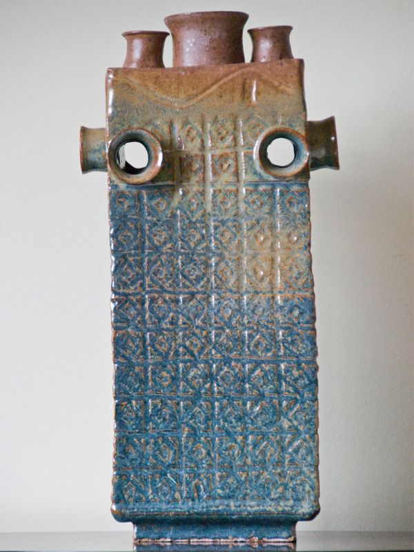
photographed by David J. Gilder
This was a piece I made in high school, maybe junior or senior year (2001 or 2002). The ceramics teacher gave the assignment of making a multi-spout slab bottle with the height requirement of 12 inches or something. All I can remember before making this piece was to go all out. I wasn't going to be bound by these rules and do the minimum requirement. So instead of 3 spouts, I ended up doing 9 as the piece evolved during the process. It stands taller than 12 inches, although I can't remember the exact height anymore, maybe about 15. I also did a slab foot (which is the part below the body of the piece) that provided an extra lift instead of just sitting there.
After putting the bits and pieces together, the body turned out to be quite boring. A flat surface was not appealing. And as you can see, I began carving into the body. The design was simple: a diamond with a dimple in the middle and the repetition of course makes the pattern. In earnest, I don't recall thinking much about this piece. I didn't have a particular idea that I wanted to explore or any specific effect I wanted to achieve. I just kinda ran with the assignment. I threw a couple spouts on the wheel and figured I'ld make it somewhat symmetrical. Making the bigger spout in the middle and placing the smaller ones next to it reminded me of the nuclear plant in the Simpsons. The spouts on the sides were really just for fun but it was also done with the mind of balance, symmetry. Just having the spouts on the top didn't make it very appealing.
I guess what comes out of playing around with the slabs, the spouts, and color scheme - if I were to force some kind of metaphorical story or meaning - is perhaps some kind of commentary on industrialization and its effect on the ocean, rivers, and streams. The pollution could be represented by the brown and the spouts give the impression of smoke stacks. The carvings give the body a ripple effect. I remember the top glaze was sprayed on and gradually blended into the blue glaze. I forget the names of the two glazes. At any rate, I suppose some kind of meaning or narrative or symbolism could be constructed in retrospect. But there wasn't much to it at the time. One of the beauties of something like this, and much of art really, is the ambiguity of conceptual space and translation. The viewer is entirely free to make whatever meaning he/she wishes. In this piece, it would be entirely legitimate and any attempts to discover the artist's intentions behind the piece would be an exercise of imagination. There was no initial intention behind the piece other than fulfilling an assignment and make it look good to my taste. No meaning, no deliberate symbolism, no nothing when the piece was done.
Thursday, January 8, 2015
Wednesday, January 7, 2015

Friday, January 2, 2015
Sunday, December 28, 2014
Tuesday, December 23, 2014
Saturday, December 20, 2014
Monday, November 24, 2014
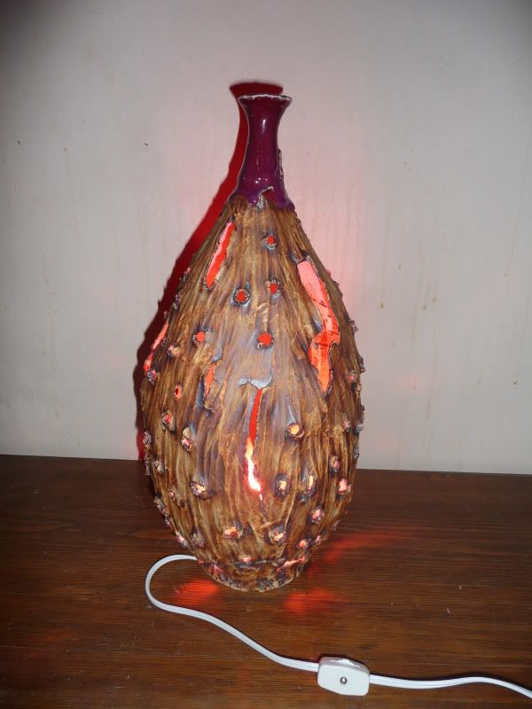
Reflections: Luminated
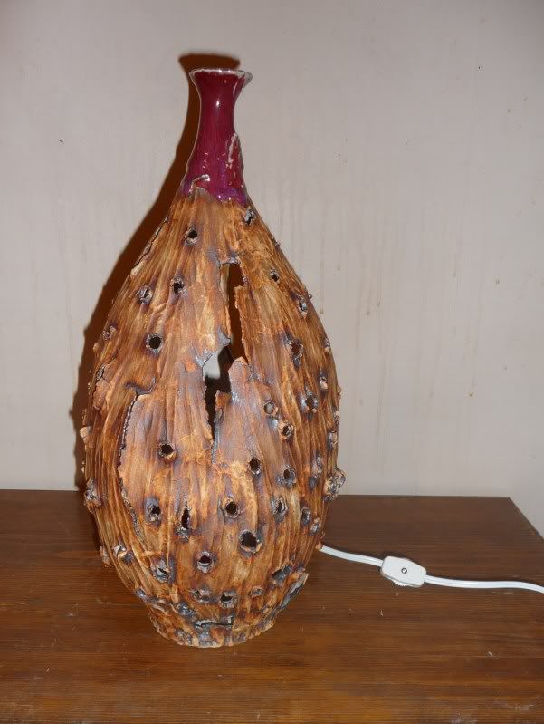
So this is another piece that I enjoy quite a bit (most of them I don't really like and there's only a handful that I'm actually happy about). And if you can't tell by now, I like throwing bottles; I find them fun to throw and the form is aesthetically pleasing i.e. I think it's sexy.
In terms of timeline, it's also relatively recent (somewhere between 2008 and 2010). As you can see, I'm still very much into the handcarving. I've also been playing with the idea of giving the piece an old and tattered look. Like it's gone through a lot of wear and tear - something that showed endurance. I think the idea here, with the holes, was to make it look like a tin can that's been shot at. And the bullets have ripped through its being and yet it stands with character and beauty intact. I was also playing around with a lot of staining. The body of the piece is painted with red iron oxide and then wiped off, which complements the carving and gives it that texture and leathery look. There are other types of glazes that would bring out the texture and accentuate the breaks but I was doing a lot of staining at the time for two reasons: 1) I hate glazing - I find it the most difficult part and yet it is what can make or break the aesthetic of a piece. Sometimes the fire gods are good and sometimes they're not so kind. I found that staining was reliable and I didn't have to worry about the little variables from glazing; did I mix the glaze enough? is it on evenly? did I wipe the bottom properly? is there enough wax? blah. It becomes a hassle. So staining, although your hands get a nice coat of red iron oxide and have to wash them like crazy - even then you'll still have a spotty hand. But I don't mind this. And 2) I like the effect of stains.
When I made this piece, there was another person playing around with lamps. So I figured hey, why not? I decided to make some kind of luminary. The holes were supposed to help with the effect of the light - kind of make it look like something is bursting from the inside out.
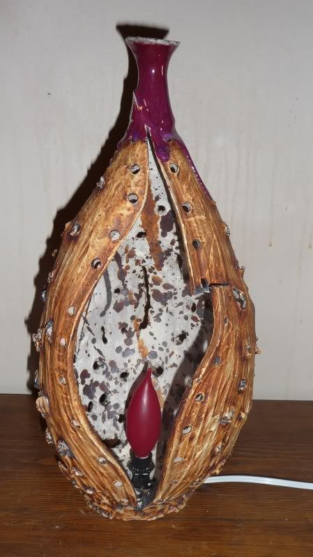
In order to put a light bulb in I had to make an opening. I didn't want to make a conventional lamp, which wouldn't require any opening just making sure that the wire went to the top of the bottle. At the same time, I wanted the opening to bring out the form of the bottom... but what do you know, I made a vagina. It gave an entirely different twist to the piece with the light bulb in the middle, which I will simply leave to your imagination. I also splashed some red iron oxide on the inside. But, I regret doing this and it was too late to wash it off. I think it would have looked better without the staining on the inside. I also had the idea of lacing the middle together with some hemp rope - like shoe laces. I thought it would have a pretty cool effect and give a sense of binding something together, which would add to the theme of suffering. Never got around to trying it though. Maybe when I go back to my parents house one day I'll do it and see what it looks like.
I glazed the tip of the bottle cherry red, which gave it a nice purplish magenta color. No particular meaning at the time other than wanting something reddish to complement the staining. But, like I just said, there is an interpretation to be had in a symbolic sense.
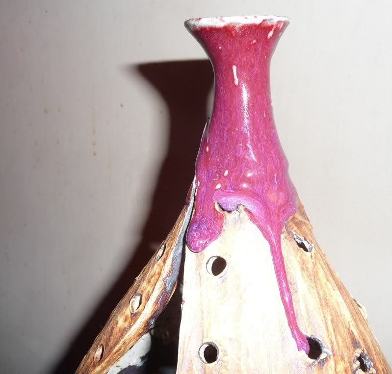
In retrospect, I wish the fire gods had graced me with a bit more
running (the drip effect) from the glaze but I'll take it. I'm a bit divided on the glaze.
Part of me wishes that I hadn't done it and part of me kind of likes
it. I'm not sure.
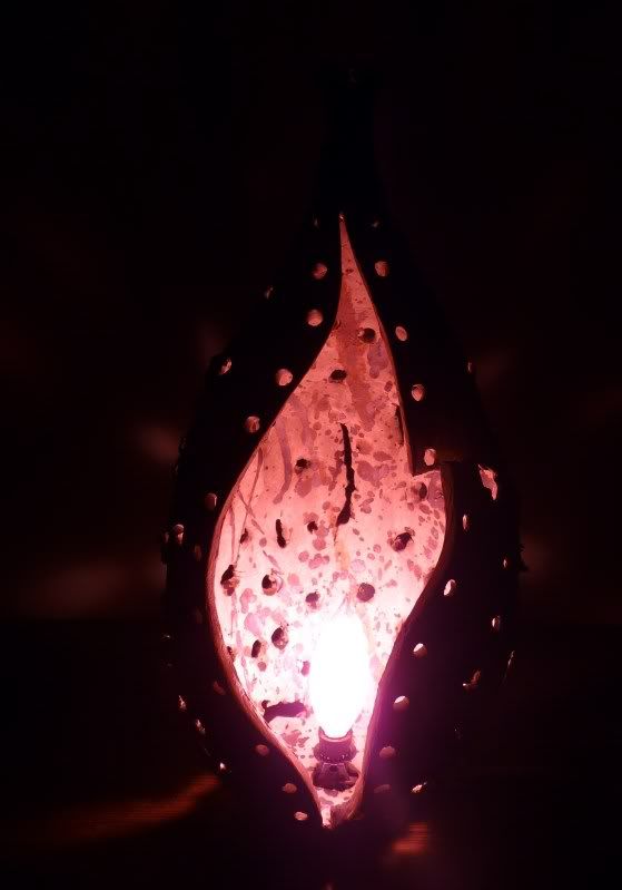
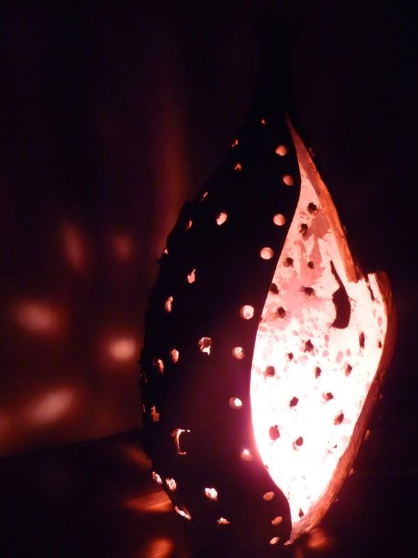
So it was time to try it out. What did it look like with the red light bulb? From the back:
So it was time to try it out. What did it look like with the red light bulb? From the back:
And in the dark, from the front:
To the side:
And again the front
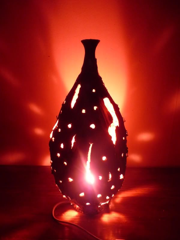
It wasn't quite the magnificent effect that I had envisioned. I guess I thought the holes and produce a greater refraction of light - perhaps I needed a brighter light bulb. I tried it again with a white light but I didn't like it. So I played with the camera effects a bit and:
SuperSaiyan!! lol.
So I really enjoyed making this piece and there are a few things that I would definitely do differently now if I were to make something similar again. This definitely served as a "draft" or a kind of prototype for something in the future (whenever I get a chance to jump back into a studio that is). At any rate, I like the ambiguity and there's enough symbolism to give space for various interpretations (i.e. room for meaning).
Wednesday, November 12, 2014
Friday, November 7, 2014
Reflections: Carved Celadon Bottle
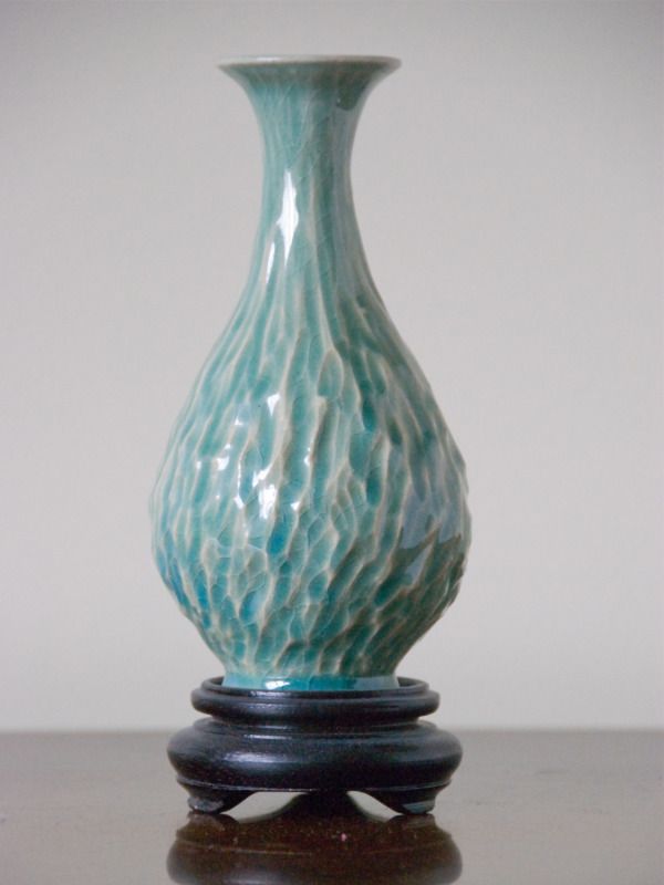
photo: dj gilder
Thought I'ld recirculate some of my stuff, I have a lot more work from the past but no pictures - so until I get my hands on some clay and a wheel or get back to my parents' home and take a few more pictures I figured I'ld just repost and give a little background to each piece.
So this is one of my favorite, if not the most cherished, pieces from the stuff I've done. It's a small piece, about 6 inches in height, glazed in celadon. During the summer of 2005 I had the opportunity to go to Japan and as I now tend to do where ever I go is to seek out a pottery studio (Durham proved to be a bit difficult). After enlisting the help of a member from the lab I was working in, he found a studio with an english speaking owner who could help me in the little ways that prove to be invaluable.
This was my first encounter with a non-western wheel and style of throwing. Of course, my hands were trained in the U.S. In Japan, like Korea, the wheel turns clockwise whereas the wheel goes counter-clockwise in much of the "west" (there were other nuances when I worked with a wheel in Prague). Fortunately, the wheels had a switch to change direction.
So I threw this little bottle and a couple days later when it was time to trim the piece, I got lazy - I didn't want to center it and the process of centering a bottle takes a minute. So I decided to hand trim the bottle - this was the first time I took the care to hand trim the body in a faceted manner. It would soon become an aesthetic and style I would enjoy and repeat. What struck me while I was doing this was the process of taking something symmetrical towards something asymmetrical. Of course, the empty space that gives the bottle its shape is symmetrical but the carving provided subtle imperfections and a sense asymmetry.
In other words, hand-carving/trimming the piece took the intention of striving for perfection away from the aim of throwing (we usually begin by learning to throw a symmetrical, even, cylinder) and the aesthetic of a "perfect form." Instead, the carving provided asymmetry, imperfections, depth, and texture that would break the glaze such that the color would accentuate the carvings. It pronounced the beauty of subtle imperfections and the dynamics of being multifaceted.
Tuesday, November 4, 2014
Phenomenal
Phenomenal from R&A Collaborations on Vimeo.
"Jin Eui Kim is a ceramic artist, originally from South Korea. He graduated from Cardiff School of Art & Design with a MA and PhD in Ceramics, during which time he studied the illusory effects of application of black through to white to three-dimensional surfaces.
Jin Eui explores in depth tonal effects and spatial illusions, creating works that are both visually and intellectually challenging. He makes both none-functional sculpture works of horizontal and vertical cylinder forms and functional ware, applies the principles of creation of illusory spatial phenomena such as gradient in tone and size of bands. He also tries to understand more, the quality of clay and how it can be combined with subtle variations of tone to create the illusory spatial phenomena.
jineuikim.com"
via musing about mud
Saturday, October 25, 2014

Tuesday, October 7, 2014
A Thousand Year Journey (documentary to be featured at Sundance)
"A documentary on the craft of Korean ceramics will be competing in
the documentary portion of the upcoming Sundance Film Festival, reports the Korea Times.
A Thousand Year Journey, directed by Michael Oblowitz, explores the history of the craft in Korea, from the Goryeo Porcelains to the Joseon White Porcelain. It will feature five Korean master ceramicists and their processes in creating their pieces.
[...]
The traditional craft of Korean ceramics has experienced a recent resurgence in Icheon, Korea, but it has yet to enjoy the same widespread global popularity of Chinese and Japanese ceramics, according to Edward Ahn, president of the Cultural Foundation of America. The documentary, he hopes, will increase knowledge of the art."
source
Saturday, October 4, 2014

Saturday, September 13, 2014
Saturday, September 6, 2014
Subscribe to:
Posts (Atom)